Persona Pony ideas for thebeth

blackestbird

Teeny Tiny Baby Pony
Joined
Dec 15, 2008
Messages
2,361
thebeth said she wanted a persona pony, so I decided to offer to help, and she gladly accepted!

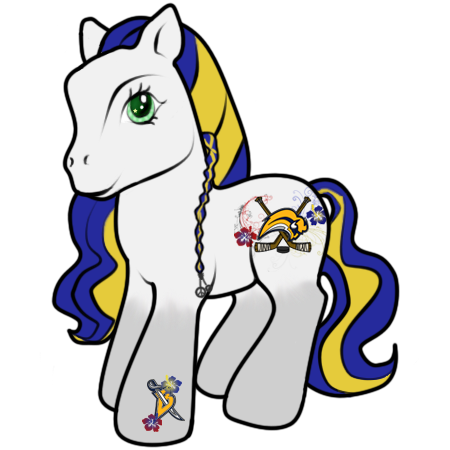
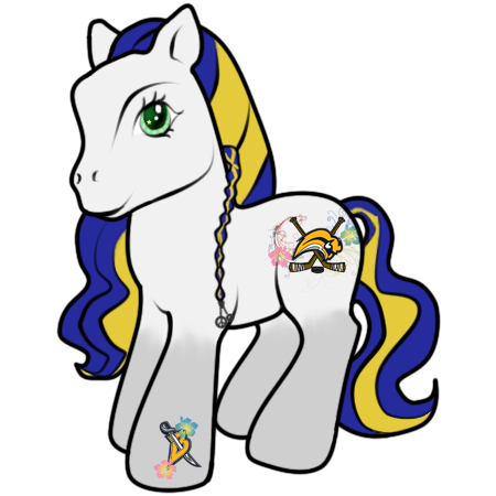
Ok, here's where I'll post the ideas hun. Here's the first one. She's the only one I've done so far. If you end up liking this one, I can shade her and stuff later for you. Oh, and don't feel bad if you don't like her. You won't hurt my feelings!

A little explanation: I used the bright color combination you liked - the minty green, with bubblegum pink and bright blue hair. Threw some silver in there too. The symbol comines your love of surfing/tropical stuff and hockey. Crossed hockey sticks and a puck, with a surboard. The surfboard has the Vancouver Canucks color scheme and symbol, while the hibiscus flowers and swirls have the Florida Panthers and Buffalo Sabres colors. Cutie mark I just did the two hibiscus again, but we can change that. At the end of her surfer braid/dread, there is an orange peace sign bauble.

thebethpersona.png
 
oh wow... that's really creative. I'm not sure about the green. I kinda like green on it's own and then the bubblegum colors together.
Hah, I wasn't expecting you to work everything I said into this!

I'm totally loving the hibiscuses. I think they're my favorite feature so far.
Your idea is spurring my own ideas haha.
 
is it okay if we incorporate some NHL logos?
I mean is there some unwritten rule that I can't?
I might want to swap out the surfboard for a logo.
 
I have an idea, and if you like I can color it out like I did here.

You say you don't like the surfboard. Rather have a logo. I think, if you kept with the hibiscus and swirls in the symbol, the Canucks logo goes best; it's beachy and hockey in one symbol

I have some more ideas. I'll draw them out later though; this one tired me out a bit xD
 
Last edited:
I have an idea, and if you like I can color it out like I did here.

You say you don't like the surfboard. Rather have a logo. I think, if you kept with the hibiscus and swirls in the symbol, the Canucks logo goes best; it's beachy and hockey in one symbol

I have some more ideas. I'll draw them out later though; this one tired me out a bit xD

aw I'm sorry you worked so hard... I know the Canucks logo does go really well it makes sense. But I'd feel silly having that as the mark in that they're like 3rd on my list. I'm okay with disorder lol.
I think I want a Sabres logo, but I'm not sure which one. My favorite is with the crossed swords, but I really like how you used the hockey sticks. I'm thinking maybe the mad cow design.

I really like this one
MySabresLogo-3.gif


You know, the bg is unnecessary b/c you have the sticks. So maybe just the Buffalo head?

ugh I feel so picky.
 
blehhh don't go knock yourself out before talking to me again. I don't want you to go nuts if I'm unsure lol.

thanks for this!!!
 
Oh don't be silly! I just didn't know how well you wanted the pony's design to flow.
I could definitely stick the buffalo head in in place of the surfboard.

So I can do that, and then do you like the rest of the symbol?

And I can change the pony colors too. If you like the green, I can give her different hair colors. Or I can give her one of the teams color schemes.
 
well I mean I just went off and told you a lot of things I like, not at all expecting you to try to incorporate all of it!
It's a lot of incongruous stuff. I think the sticks almost pull it off though. They have a tiki-look to them cause they're brown so it's almost tribal-ish. Which works with the flowers, and since they're sticks- woo hockey! Don't get me wrong, I do love what you did but I still want to tweak it.
Now that I went off on that tiki tirade, I'm going to study the logos and pick the one I think best suits that.

The colors are something I have to moll over. I really like a lot of personas that have some type of gradient. Whether in the hair, or yours is actually really cute too so I think I might want a gradient somewhere... I will think on these things and get back to you.
 
ugh logo picking is tough...
I like the mad cow looking one, but it was with their old colors like this:
logo_buffalo_sabres_1996.gif

which is why I was partial to this one:
MySabresLogo-3.gif

because they worked in the new colors...

But then this is their current logo:
nhl-sabres.jpg


So I'm having trouble deciding whether to go current, or old with current colors.

I DO have another idea I want to try...
could you try working this:
Buffalo_Sabres_Secondary.gif
into the hoof mark? with the flowers? I love how they are by themselves, I just want to see what it would look like.


Still molling over body&hair colors.
 
nhl-sabres.jpg


Buffalo_Sabres_Secondary.gif
into the hoof mark? with the flowers?


Okay, I had to pop in! The surfboard was a little too much eye work going on there. I like the logo with just the buffalo.

And the B with the sword is a nice little hoof mark! I think, instead of just the silver, I'd add in some yellow into the hair as well. I love the rest though!
 
Okay, I had to pop in! The surfboard was a little too much eye work going on there. I like the logo with just the buffalo.

And the B with the sword is a nice little hoof mark! I think, instead of just the silver, I'd add in some yellow into the hair as well. I love the rest though!

haha! actually that's really helpful. I'm still not sure on the hair/body colors but I think I'm liking these two logos to be incorporated!
I've always loved that shoulder symbol... the B with the sword. I like to use it to spell Beth with too, it's cool looking!
 
oh my gosh! I love them both! Wow... I dunno which to pick.
I'm still not sure I'm done bothering you... I feel like the gradient is too subtle. I LOVE the cutie marks but still not done on the colors.
I'm sorry I'm such a pest. You rock so much though.
 
Back
Top